Banished to the Abyss: What Happened to the Art of the Set Design?
By Amy Walter
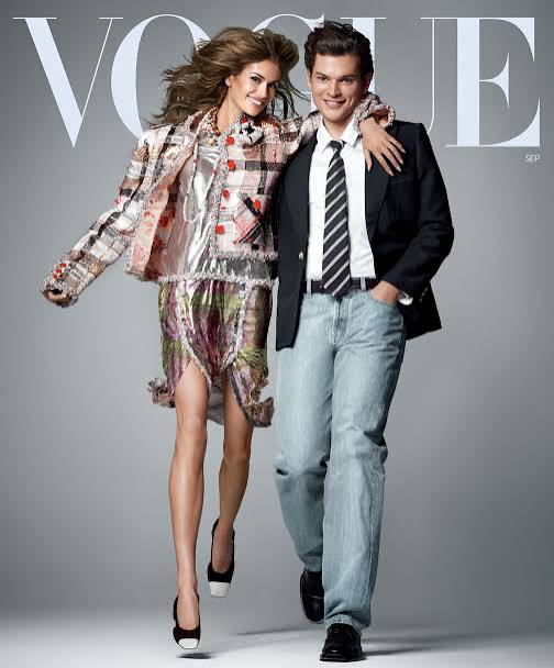
As interior design and fashion have succumbed to the age of beige, it was perhaps only a matter of time before the media we consume began to reflect and reinforce the same phenomenon. Where magazines once functioned as the antithesis of boringness, with flashy colours, elaborate concepts and instantly recognisable covers, titles like Vogue and Vanity Fair can now feel almost interchangeable once you open their pages. Across increasingly sparse newsstands, distinctive artistic identities are becoming harder to find.
Perhaps the most overlooked victim of this shift is set design.
Vogue
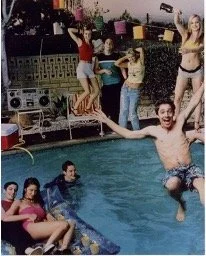
Looking through my own magazine collection, modern issues usually contain at least one or two editorial spreads that rely on a studio backdrop rather than a fully realised set. Gen Z stars are sentenced to the purgatory of the white background, posing to promote new shows and movies in spaces that could belong to almost anyone. It is a far cry from the party reenactments, bedroom sets and surreal worlds once created to promote shows like Skins or films like American Pie.
The obvious explanation is budget. Magazines, even the most popular, are making cuts in an increasingly paperless world, and every part of the editorial process has felt the consequences. The shift towards minimalism may reflect our current cultural zeitgeist, but it is also a practical response to an industry with fewer resources to spend on creative excess.
Yet there is something more significant being lost here than an expensive backdrop. Set design has always been one of the ways magazines transform celebrities into characters and promotion into fantasy. A physical set can create a world around a person. It can tell us something about their image, their work, or the culture surrounding them. When that disappears, so does part of the escapism that made these shoots feel like events.
It’s All Coming Up David LaChapelle
To understand what has been lost, look no further than the glory days of print media. When TV guides could celebrate reality television with Denise Richards as Godzilla, or Rolling Stone could send Star Wars stars to the beach, creativity was not an optional extra. It was woven into the promotion of 90s and 2000s media.
You could see the ambition everywhere. Television shows with sprawling casts and twenty-episode seasons were given elaborate promotional shoots. Film stars were placed inside surreal scenarios. Celebrities became characters within miniature worlds that extended the identities of the shows and films they were promoting.
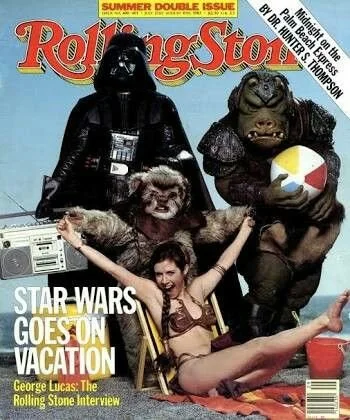
Rolling Stone
Perhaps no photographer represents this era better than David LaChapelle.
Hired by Andy Warhol to work at Interview magazine, LaChapelle built an iconic visual language around colour, surrealism and theatrical set design. His collaborations with production designer Annie Sperling brought those ideas into physical spaces, creating sets that were as much a part of the image as the celebrity themselves.
During the 90s, his work with The X-Files star Gillian Anderson became some of the show's most memorable promotional photography. Aliens, swamp monsters and surreal landscapes transformed the pages of Rolling Stone into The X-Files on acid. The shoots did not simply advertise a television show. They expanded its universe.
That is the magic of production design. It takes something we already know and gives us another way of seeing it.
The TV Guide Era
Once upon a time, the weekly TV Guide cover was not simply a collage of promotional stills from the week's biggest shows. It was a carefully considered shoot that could parody, exaggerate and play with the stars themselves.
For television actors, these shoots became something of a rite of passage. From Sex and the City in TV Guide to Friends in Entertainment Weekly, magazine appearances helped cement the cultural status of a show. The images became part of the way we remembered these programmes.
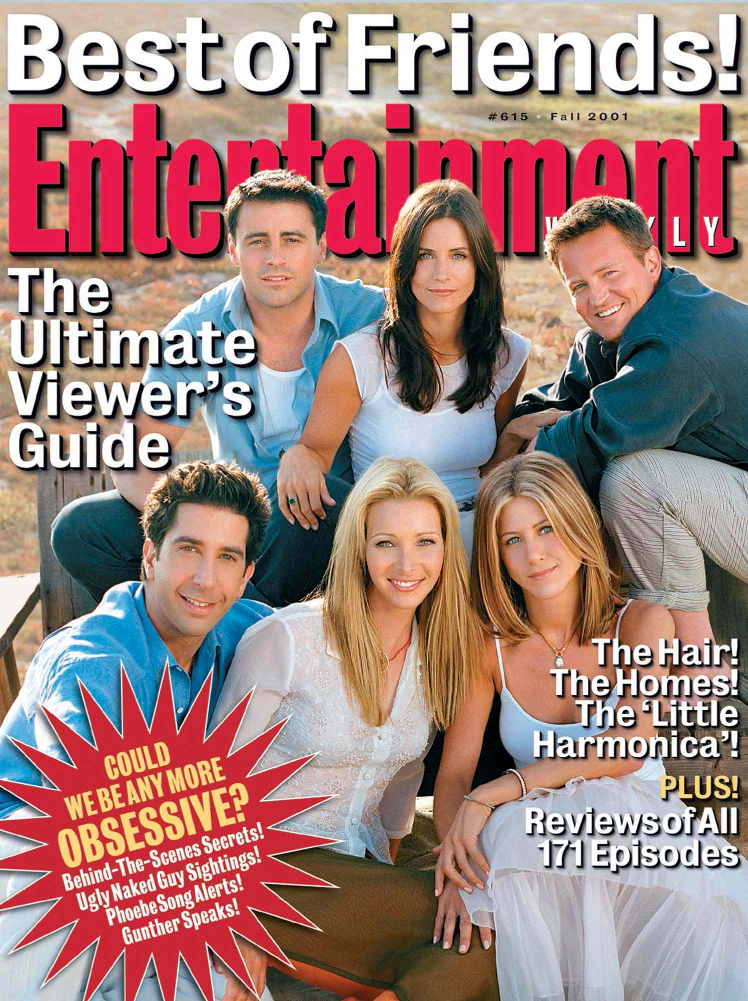
Entertainment Magazine
The physicality of the sets helped turn familiar characters into icons. A magazine could take a sitcom and build an entire world around it; it could exaggerate a character's personality, place actors into absurd situations, or recreate elements of a show in a way that felt larger than the screen itself. The result was promotional material that could have a life beyond its original purpose, as the shoot itself became part of the culture.
The Teenage Dream
The same ambition extended to the teen media takeover of the 2000s. As teenage stars dominated movie theatres and television screens, they also took over physical media. Vogue, People and Vanity Fair embraced the phenomenon, while youth-focused titles like J-17 and Seventeen built entire editorial identities around it.
One of the most famous examples was Vanity Fair's 2008 "It's Raining Teens" issue, which featured stars including Hilary Duff and Mandy Moore in playful, highly constructed environments. Instead of the stiff celebrity portrait, readers got pillow fights, classrooms and bedrooms.
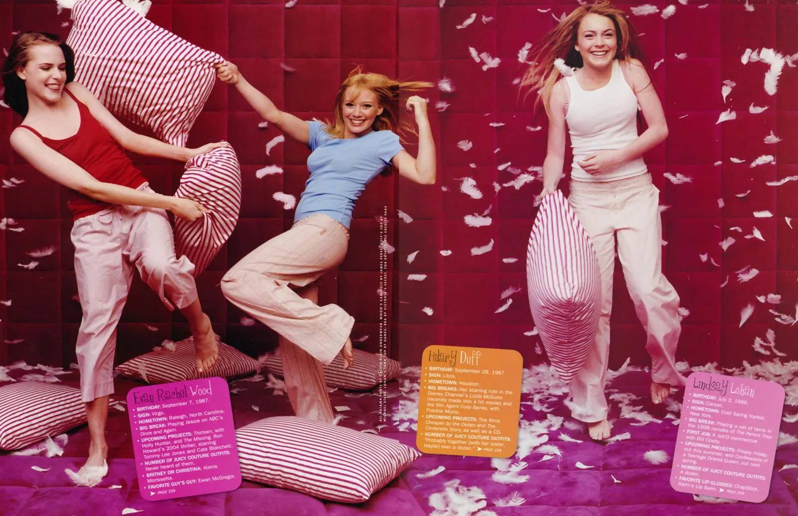
Vanity Fair
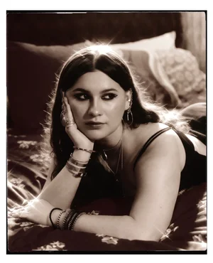
The bedroom, in particular, became a playground for set designers. It could be customised to suit a celebrity's personality, a fictional character, or the fantasy being sold to the reader. These sets offered fans an imagined glimpse into celebrity life. They created the illusion of access, inviting us into bedrooms, schools and social circles that existed somewhere between reality and fantasy.
That tension is important. The elaborate shoots of the 2000s were not always innocent. With hindsight, the era's creative excesses came with their own problems, from the sexualisation of teenage stars to unhealthy dieting advice. The nostalgia cannot be completely separated from those realities.
But the visual ambition is still worth examining. These shoots understood something that contemporary promotion can sometimes forget: people want not only information about the media they consume but to enter its world.
The Set Comeback?
Thankfully, set design has not disappeared completely. There are still photographers, magazines, and production designers keeping the art of theatrical, campy and intricately detailed imagery alive.
In a 2023 W Magazine shoot, Jennifer Coolidge was transformed into a sci-fi heroine surrounded by a shrunken city. The shoot was directed by the fantastical minds behind Everything Everywhere All at Once and brought to life by production designer Calder Greenwood, whose handmade props and cardboard constructions give his work a cartoonish, deliberately artificial quality.
It works because the set understands its subject. Jennifer Coolidge is not placed against an anonymous studio wall. She is given a world big enough to accommodate her particular kind of camp.
Interview magazine remains another favourite of mine because it seems to understand that a magazine can still be a space for cultural performance. It has consistently embraced the idea that a celebrity shoot can become something stranger and more memorable than straightforward promotion.
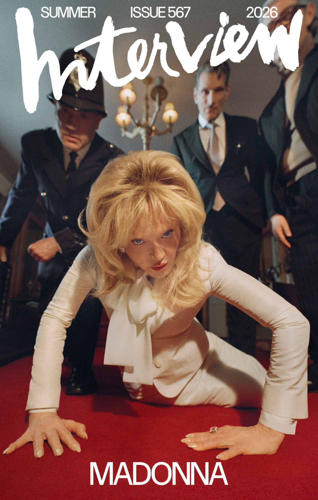
Interview Magazine
For its summer issue, Madonna was transformed into "DeDe" under the lens of Nadia Lee Cohen, a character described as a fun, hard-living woman who drank prosecco, did her hair big, and blasted the Stones. The backdrop is populated by characters, retro furniture, and a poker game, creating an entire narrative around Madonna rather than simply photographing her.
Cohen is exactly the kind of photographer to watch if you long for the era when studio photography could mean building a world rather than simply placing someone in front of a wall.
What We Lose When Everything Is Beige
All of this is to say that there is still hope. Production designers remain some of the people who make our movies, television shows, and magazines feel alive. Their work is not decoration. It is storytelling.
A set can establish an era, reveal a character, create a joke, build a fantasy, or turn a promotional image into something worth remembering decades later. It can make the fictional feel real, or make the real feel completely absurd. Most importantly, it gives media an identity beyond its basic function.
That is why the decline of elaborate set design feels like part of a larger cultural shift. The problem is not that white backdrops are inherently bad, nor that every photoshoot needs a miniature city or five pink aliens. It is that when cost-cutting, algorithms, and visual sameness begin to dictate what creative work should look like, we lose some of the weirdness that makes culture memorable.
I mourn the shoots that could have been if times were different. I look at the elaborate promotional images of the 90s and 2000s and wonder what they would have done with the television we have now. Would Overcompensating get a bedroom set that spiralled into something surreal? Would Yellowjackets get a photoshoot as strange and unsettling as its mythology? Would The White Lotus be given an entire resort to play with? These shows already have worlds worth exploring; their promotional imagery should too.
Perhaps the real tragedy of the beige era is not that everything looks the same. It is that we have become so accustomed to visual restraint that extravagance now feels exceptional. And maybe that is exactly why the set needs to come back!